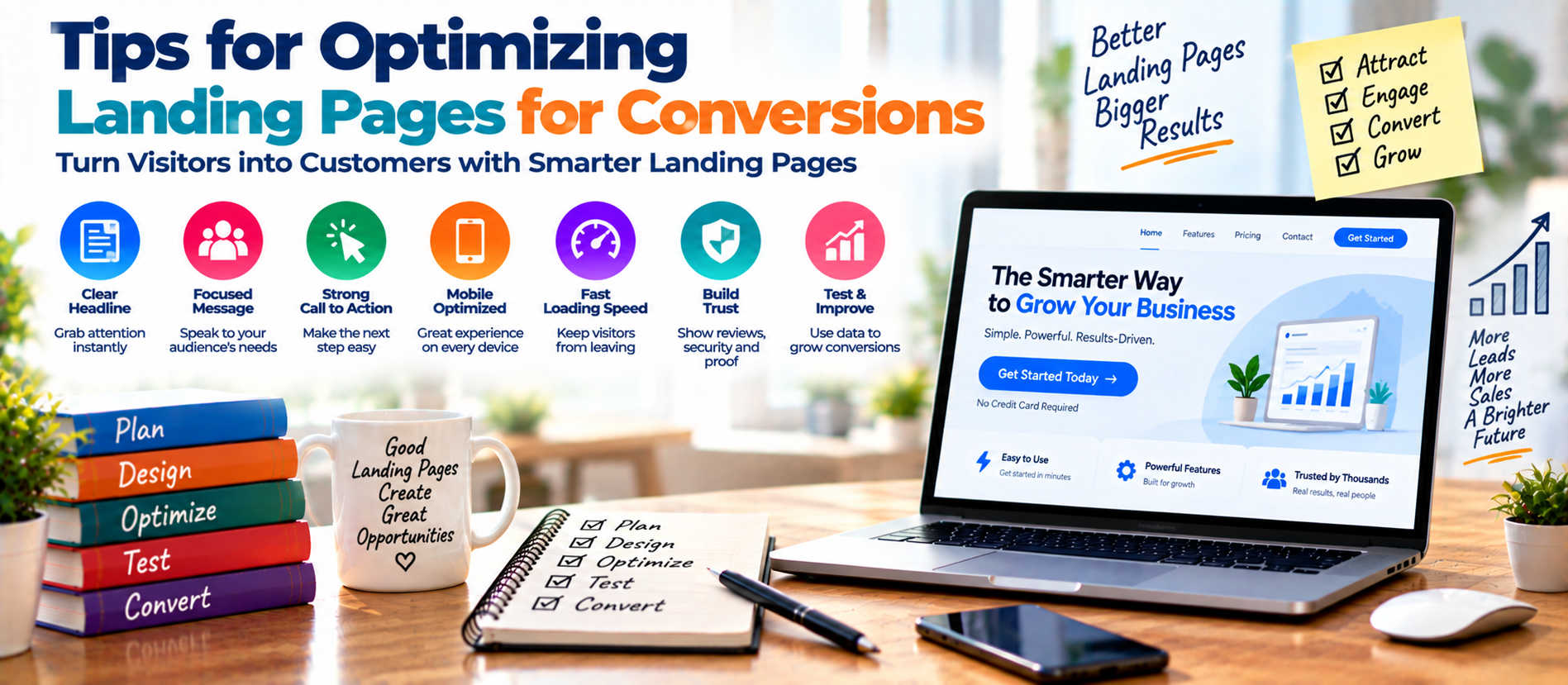
📋 Quick Summary
In this article:
What Is a High-Converting Landing Page?
1. Start With One Clear Conversion Goal
2. Match the Landing Page to the Traffic Source
3. Write a Strong, Specific Headline
4. Make the Value Proposition Obvious
5. Use One Strong Primary CTA
6. Reduce Form Friction
7. Build Trust Before Asking for Action
9. Design for Mobile First
10. Improve Page Speed and Core Web Vitals
11. Keep the Visual Hierarchy Simple
A landing page has one main job: move a visitor toward a clear action. That may be a purchase, form submission, call, booking, download, or signup. When the page is confusing or slow, visitors leave. A focused page can turn more visitors into leads or customers.
Optimizing landing pages for conversions is not about adding more buttons or making the design louder. It is about removing friction and helping the right visitor make a confident decision.
Current benchmark research shows why this matters. Un bounce analyzed more than 41,000 landing pages, 464 million unique visitors, and 57 million conversions in its benchmark dataset. Its research also found a negative relationship between conversion rates and difficult words, reading time, and word count. In other words, clear and focused copy matters.
What Is a High-Converting Landing Page?
A high-converting landing page is a focused page designed around one primary goal. It gives visitors enough information to understand the offer, trust the business, and take the next step.
A strong landing page usually includes:
- A clear headline
- A useful supporting message
- One primary conversion goal
- A visible call to action
- Relevant benefits
- Trust signals and proof
- Simple forms
- Helpful visuals
- Mobile-friendly design
- Fast and stable performance
1. Start With One Clear Conversion Goal
First, decide what you want visitors to do. Do not give equal importance to many competing actions.
If the campaign goal is to generate leads, make the lead form or booking action the main focus. If the goal is a product purchase, make the purchase path obvious.
Secondary actions can exist, but they should not compete with the primary CTA.
2. Match the Landing Page to the Traffic Source
Message match is important. A visitor who clicks an ad promising “Free Website Audit” should land on a page that clearly offers that audit, not a generic homepage.
Match the headline, offer, audience, language, and intent between the traffic source and the landing page. This reduces confusion and creates a smoother journey.
3. Write a Strong, Specific Headline
The headline is often the first major piece of copy visitors read. It should explain the value of the page quickly.
A weak headline might say:
“Welcome to Our Digital Marketing Services.”
A stronger version could say:
“Generate More Qualified Leads With a Data-Driven Digital Marketing Strategy.”
The second version communicates a result and gives the visitor a reason to continue.
Simple Headline Formula
Audience + problem or goal + useful outcome
Keep the language direct. Avoid unnecessary jargon. Un bounce's benchmark research found that more difficult words were negatively correlated with conversion rates, reinforcing the value of simple copy.
4. Make the Value Proposition Obvious
Your visitor should quickly understand three things:
- What are you offering?
- Who is it for?
- Why should they care?
Answer these questions near the top of the page.
Focus on outcomes rather than only features. Instead of saying “24/7 automated reporting,” explain the business value: “See campaign performance without building reports manually every week.”
5. Use One Strong Primary CTA
A call to action tells visitors what to do next. Use specific language that describes the action or benefit.
Examples include:
- Get My Free Audit
- Book a Strategy Call
- Start My Free Trial
- Request a Quote
- Download the Guide
Generic phrases such as “Submit” provide less context. The CTA should stand out visually and remain easy to find as visitors move through the page.
6. Reduce Form Friction
Forms can increase leads, but every extra field can create friction. Ask only for information you genuinely need at that stage.
For an initial consultation, you may need a name, email address, company, and a short description of the requirement. You may not need a long questionnaire before the first conversation.
Use clear labels, helpful error messages, logical field order, and a mobile-friendly layout.
7. Build Trust Before Asking for Action
Visitors may hesitate because they do not know whether your company is reliable. Trust signals can reduce that uncertainty.
Useful elements include:
- Customer testimonials
- Case studies
- Relevant client logos
- Ratings or reviews
- Industry certifications
- Security information
- Clear contact details
- Transparent pricing or process information
Use proof that is relevant to the visitor and offer. Specific evidence is stronger than vague claims.
9. Design for Mobile First
Many campaigns receive substantial mobile traffic. Un bounce's benchmark research specifically highlights the importance of mobile optimization and notes that mobile traffic can dominate in some industries.
💡 Key Insight
Check your page on real phones. Make sure the headline is readable, buttons are easy to tap, forms are comfortable to complete, images do not push important content too far down, and horizontal scrolling does not occur.
Design the mobile experience intentionally.
10. Improve Page Speed and Core Web Vitals
A slow landing page can waste paid traffic and damage user experience. Google recommends good Core Web Vitals and identifies three key metrics: Largest Contentful Paint, Interaction to Next Paint, and Cumulative Layout Shift. Google's guidance recommends an LCP within 2.5 seconds, INP below 200 milliseconds, and CLS below 0.1 for a good user experience.
Improve performance by compressing images, reducing unnecessary scripts, using efficient caching, limiting third-party tools, and choosing reliable hosting.
Do not optimize only for a perfect score. Google also considers mobile usability, security, intrusive elements, and overall usability.
11. Keep the Visual Hierarchy Simple
Visitors should know where to look first, second, and third. Use typography, spacing, headings, contrast, and visual grouping to guide attention.
Do not fill every empty area with graphics. White space can make important information easier to understand.
Your design should support the conversion goal. A beautiful landing page that hides the CTA is not an effective landing page.
12. Use Relevant Images and Video
Visual content can explain products, services, processes, and results faster than long blocks of text. Use screenshots, product demonstrations, diagrams, before-and-after examples, or short videos when they genuinely help.
Avoid decorative stock images that do not support the offer. Every major visual should have a purpose.
13. Explain Benefits Before Technical Details
Visitors usually want to know what your offer can do for them before they want to study every specification.
Structure your copy around the visitor's decision:
- Problem
- Desired outcome
- Solution
- Key benefits
- Proof
- How it works
- Objection handling
- CTA
This structure makes the page easier to scan and supports visitors at different stages of consideration.
14. Answer Objections Before They Stop the Conversion
Visitors may have questions about price, timing, quality, security, support, contracts, returns, or results. If these concerns remain unanswered, they may leave.
Add a short FAQ or objection-handling section. Keep answers direct.
Useful questions include: How long does the process take? What is included? Can I cancel? Is there a free trial? How is my information protected? What happens after I submit the form?
15. Use Landing Pages for SEO, AEO, GEO, and AI Search Carefully
A landing page can support organic discovery when it contains useful, relevant information. But a page built only for search engines can hurt conversions.
For SEO, use a descriptive title, logical headings, relevant internal links, useful content, descriptive image text, and a crawlable technical structure.
For AEO and AI Search, answer common questions directly and use clear definitions.
Google's current guidance says foundational SEO remains relevant for its AI-powered search experiences. There is no special shortcut that guarantees visibility in AI-generated results. The better approach is to create useful, original, people-first content with solid technical foundations.
For GEO, focus on topical relevance, trustworthy information, original insights, and genuine user needs.
16. Create Strong Message Continuity
When a visitor clicks an ad, email, social post, or search result, the landing page should continue the same conversation.
For example, if your advertisement says “Get a Free SEO Audit,” the landing page headline should repeat or clearly reinforce that offer.
This creates message continuity and reduces the mental effort needed to understand the page.
17. Use Analytics to Find Conversion Problems
Do not judge a landing page only by its conversion rate. Look at the full journey.
- Traffic source
- Landing page views
- Engagement
- Scroll behavior
- CTA clicks
- Form starts
- Form completions
- Qualified leads
- Sales or revenue
HubSpot's 2026 marketing statistics identify lead quality, lead-to-customer conversion rate, ROI, customer acquisition cost, and lead generation volume among the key metrics marketers use.
This shows why a landing page should be connected to the wider marketing and sales measurement system.
18. Run A/B Tests With a Clear Hypothesis
A/B testing compares different versions of a page or element. Test one meaningful change at a time.
You can test:
- Headline
- CTA wording
- Form length
- Hero image
- Social proof placement
- Pricing presentation
- Page structure
Start with a hypothesis, such as: “Changing ‘Submit’ to ‘Get My Free Audit’ will increase completed forms because the new wording explains the benefit.”
Do not stop a test after only a small number of visits. Let the data become useful before deciding.
19. Optimize the Entire Conversion Path
A landing page cannot compensate for a broken post-conversion experience. After a form submission, show a clear confirmation message, explain what happens next, and route qualified leads quickly.
For ecommerce, make checkout simple. For B2B services, make scheduling easy. For downloads, deliver the resource immediately.
20. Avoid Common Landing Page Mistakes
- Using multiple competing CTAs
- Writing vague or complex copy
- Adding too many form fields
- Ignoring mobile visitors
- Using slow media or unnecessary popups
- Using fake urgency or unsupported claims
- Testing without enough data
- Measuring clicks instead of qualified conversions
Frequently Asked Questions
What is the most important part of a landing page?
There is no single element that guarantees conversions. A clear offer, strong message match, useful value proposition, visible CTA, trust, and low friction work together.
What is a good landing page conversion rate?
There is no universal target. Conversion rates depend on industry, traffic source, offer, audience intent, and conversion type. Un bounce's large benchmark dataset reported a 6.6% median across its Q4 2024 data, but marketers should use benchmarks as context rather than a universal target.
How can I improve a low-converting landing page?
Start by checking traffic quality and message match. Then review the headline, offer, CTA, form, mobile experience, page speed, trust signals, and analytics funnel. Test the highest-impact problems first.
Should landing pages be long or short?
The correct length depends on the offer and visitor intent. A simple signup may need little copy. A high-value B2B service may need more proof and explanation. Keep every section useful.
Are landing pages important for paid advertising?
Yes. The landing page is where the visitor experience continues after the ad click. Strong message continuity and a focused conversion path can help turn paid traffic into meaningful actions.
Final Thoughts
Optimizing landing pages for conversions is a continuous process. There is no universal design that works for every audience. The strongest approach is to understand the visitor, create a clear offer, remove friction, build trust, measure behavior, and test improvements.
Start with clarity. Make the headline specific. Match the page to the campaign. Use one CTA. Keep forms simple. Make the experience fast and mobile-friendly. Then use analytics and testing to improve results.
Digiifrog helps businesses build and improve digital experiences through SEO, AEO, GEO, AI Search optimization, web design, content marketing, and digital marketing strategies. Visit www.digiifrog.com to explore solutions focused on visibility, usability, leads, and measurable growth.
Sources and Further Reading
- Unbounce Conversion Benchmark Report — landing-page conversion research based on large-scale conversion data.
- Google Search Central — Understanding Page Experience and Core Web Vitals.
- HubSpot — 2026 Marketing Statistics and conversion optimization data.
Ready to Grow?
Talk to us about a strategy tailored to your brand — we will help you stand out in search, AI discovery and social.

Comments (0)
Log in to leave a comment.