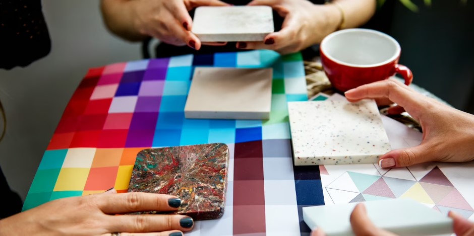
Colors play an important role in social medias, with many platforms incorporating specific colors to evoke certain emotions or create a particular image. Here are a few examples of how colors influence social media:
- Facebook: The blue color used in Facebook’s logo and interface is associated with trust, dependability, and calmness. This helps to create a sense of community and reliability on the platform.
- Instagram: Instagram’s use of pink, purple, and orange in its logo and interface is associated with creativity, fun, and excitement. This helps to create a sense of playfulness and visual interest on the platform.
Social Media Influenced by Colors

- Twitter: The blue color used in Twitter’s logo and interface is associated with trust, reliability, and calmness, similar to Facebook. This helps to create a sense of credibility and authority on the platform.
- LinkedIn: LinkedIn’s use of blue and white in its logo and interface is associated with professionalism, trust, and dependability. This helps to create a sense of reliability and credibility on the platform.
- YouTube: The red color used in YouTube’s logo and interface is associated with excitement, passion, and energy. This helps to create a sense of dynamism and visual interest on the platform.
These are just a few examples, and the impact of colors on social media can vary depending on the context, audience, and purpose of the platform. Understanding the influence of colors can be useful in creating effective social media strategies, from branding and design to content creation and engagement.
Here are Some Additional ways in which Colors Influence Social Media:
- Call-to-action buttons: The color of call-to-action buttons, such as “Sign Up” or “Buy Now,” can affect conversion rates. For example, red is often used to create a sense of urgency and stimulate action, while green is associated with growth and positivity.
- Branding: Colors can help to establish a brand identity and create a recognizable visual language across social media platforms. Consistent use of color can also increase brand awareness and strengthen brand associations.
- Visual content: Colors can be used strategically in visual content, such as images and videos, to create a desired mood or emotion. For example, warm colors like red, orange, and yellow can create a sense of energy and excitement, while cool colors like blue, green, and purple can create a sense of calmness and relaxation.
- Accessibility: Colors can also play a role in accessibility, with some colors being easier to read for individuals with certain visual impairments. For example, high contrast color combinations like black and white can be easier to read than low contrast combinations like yellow and green.
Overall, the impact of colors on social media is complex and multifaceted. By understanding the psychology of color and how it can be used strategically, social media marketers can create more effective campaigns and engage their audiences more effectively.
Color Psychology in Art and Design
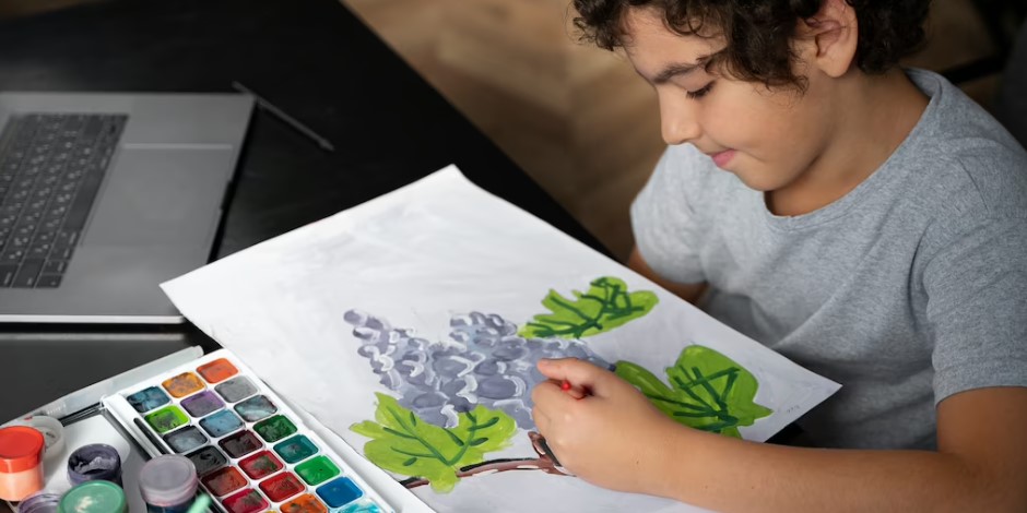
Exploring the Applications of Color Psychology in Art and Design
Color psychology refers to the study of how colors can affect human behavior and emotions. Artists and designers have long been aware of the power of colors and have used color psychology to create works that convey specific meanings and messages.
In art, colors can be used to evoke particular moods and emotions. For example, warm colors like red, yellow, and orange are often associated with energy and passion, while cool colors like blue and green are associated with calmness and tranquility. Artists can use these color associations to create works that convey a specific emotion or atmosphere.

Similarly, designers use color psychology to create visual branding and marketing materials that communicate a particular message. For instance, blue is often used in corporate logos as it is associated with trust and reliability. Yellow, on the other hand, is often associated with happiness and optimism, making it a popular choice for brands that want to project a positive image.
Designers can also use color psychology to create visual hierarchies and guide the viewer’s attention. By using contrasting colors, designers can create focal points that draw the eye and make important information stand out. For example, a designer might use a bright red call-to-action button on a webpage to make it stand out and encourage users to take action.
In summary, color psychology plays a crucial role in both art and design. By understanding how colors can affect human emotions and behavior, artists and designers can create works that communicate specific messages and evoke particular moods.
More Similar Articles of the Author
What is Color Psychology in Art and Design?
What is the start of Color Psychology?
How have Modern Ideas Evolved on the Impact of Color on us?
Analyzing the Use of Contrast and Chiaroscuro by the Old Masters
The Importance of Color in Abstract Expressionism
What is the Significance of Primary Colors in Pop Art?
What is The Experience of Entering into the Digital Art World like?
What is the Relationship Between Impressionism and Pastels?
Viewing life in All Its Hues


