
Color psychology in art and design is the study of how colors can affect human emotions, behavior, and mood in the context of visual arts and design. It involves the use of different colors to create specific effects, convey messages, and elicit certain emotions or responses from the viewer. Color psychology is used in various fields such as marketing, branding, interior design, and graphic design to influence consumer behavior and enhance the aesthetic appeal of a product or space.

Here’s some more information on color psychology in Art and Design:
Color psychology is based on the idea that different colors can have a psychological impact on people, and that these effects can be used intentionally to influence people’s emotions and behavior.
Some common associations with specific colors include red for passion or excitement, blue for calm or trustworthiness, yellow for happiness or optimism, and green for nature or health.
The cultural and historical context of colors can also play a role in how they are perceived. For example, in Western cultures, white is often associated with purity or innocence, while in some Eastern cultures, it is associated with mourning.
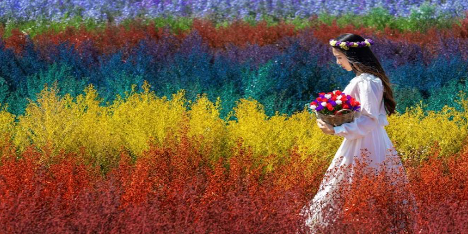
In art, color psychology can be used to create a specific mood or tone in a piece, such as using warm colors like reds and oranges to convey passion or energy, or cool colors like blues and greens to create a sense of calm or serenity.
In design, color psychology can be used to create a specific brand identity or evoke a certain emotional response from consumers. For example, a brand that wants to convey a sense of luxury or sophistication might use deep blues or purples, while a brand that wants to appear youthful or playful might use bright yellows or pinks.
Color psychology can also be used in interior design to create a certain atmosphere or mood in a space. For example, using warm colors like reds and oranges in a dining room can stimulate appetite and conversation, while using cool colors like blues and greens in a bedroom can promote relaxation and restfulness.
Cool Colors like Blues and Greens to Create a Sense of Calm or Serenity

What is color psychology?
Color psychology is the study of how colors can affect human behavior, mood, and emotions. It is based on the idea that different colors can elicit certain responses in people, and that these effects can be used intentionally to influence behavior or convey messages. Color psychology can be applied in various fields, such as marketing, advertising, art, design, and therapy, to create specific effects or evoke certain emotions. For example, a marketing campaign might use red to stimulate excitement or urgency, or blue to create a sense of trust and reliability. In art, colors can be used to create a specific mood or tone in a piece, while in therapy, colors can be used to promote relaxation or alleviate stress.
Symbolism and meanings associated with colors can vary significantly between different cultures around the world. Specific events and rituals are often linked to particular colors, with differing associations and connotations depending on the country or region.
The Sun Is up, the Sky Is Blue It's Beautiful and so Are You

More Similar Articles of the Author
What is the start of Color Psychology?
How have Modern Ideas Evolved on the Impact of Color on us?
How is Social Media Influenced by Colors?
Analyzing the Use of Contrast and Chiaroscuro by the Old Masters
The Importance of Color in Abstract Expressionism
What is the Significance of Primary Colors in Pop Art?
What is The Experience of Entering into the Digital Art World like?
What is the Relationship Between Impressionism and Pastels?
Viewing life in All Its Hues
 Content Writing
 Video Marketing
 Graphic Design
 Lead Magnet Creation
 Content Marketing