In Pop Art, primary colors hold great significance as they represent a departure from the traditional notions of fine art that emphasized the use of muted tones and sophisticated color palettes. Pop Art, which emerged in the 1950s and flourished in the 1960s, drew inspiration from popular culture and everyday life, and sought to blur the boundaries between high and low art.
Primary colors, such as red, blue, and yellow, were often used in Pop Art to create bold, vibrant, and eye-catching compositions. Artists of this movement were drawn to the simplicity and directness of these colors, which they felt captured the energy and optimism of the post-war era.
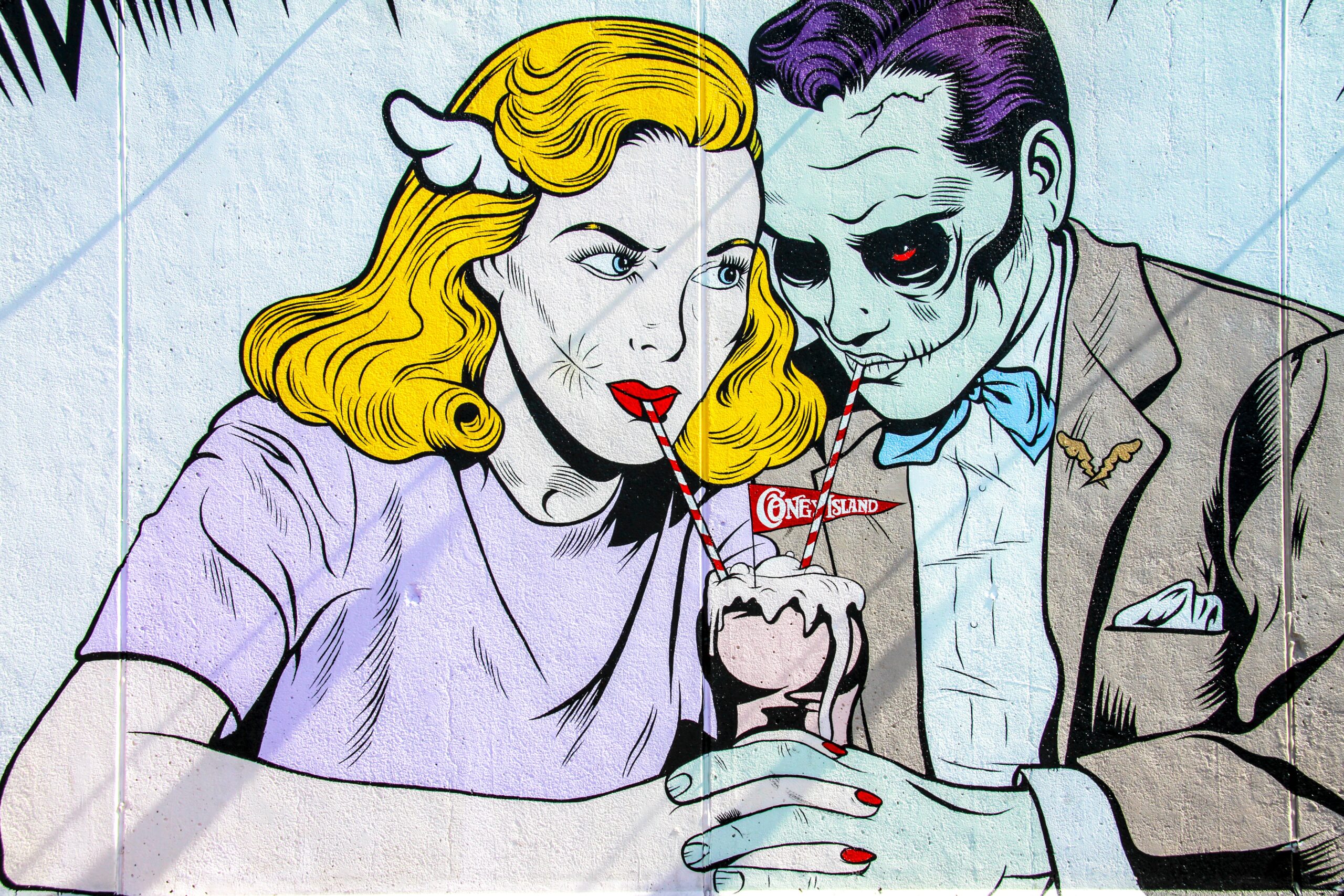
One famous example of primary colors in Pop Art is the work of American artist Roy Lichtenstein. Lichtenstein used bold black lines and bright primary colors to create comic book-style paintings and prints that were playful, irreverent, and accessible to a wide audience. Other notable Pop Art artists who used primary colors in their works include Andy Warhol, who used bright, saturated colors in his famous screen prints of Marilyn Monroe and Campbell’s Soup cans, and Claes Oldenburg, who used bold primary colors in his sculptures of everyday objects such as hamburgers and typewriters.
Primary Colors in Pop Art

The Significance of Primary Colors in Pop Art:
- Accessibility and universality: Pop Art sought to create art that was accessible and relatable to a wide audience. Primary colors, being simple and direct, appealed to a broad audience and could be easily recognized and appreciated by people from all walks of life.
- Emphasis on mass production: Pop Art often made use of mass production techniques such as screen printing, which relied on a limited number of colors. Primary colors were ideal for this approach, as they allowed for the creation of bold and striking images that could be easily reproduced.
- Boldness and simplicity: Pop Art celebrated the simplicity and boldness of everyday objects and popular culture. Primary colors, being the most basic and fundamental colors, were a perfect fit for this aesthetic.
- Irony and humor: Many Pop Art works used primary colors in a playful and ironic way, often mocking or subverting traditional fine art conventions. For example, Roy Lichtenstein’s comic book-inspired paintings used bright primary colors to create a sense of playfulness and humor.
The use of primary colors in Pop Art represented a departure from the traditions of fine art, emphasizing accessibility, simplicity, and universality. Through their use of bold, vibrant colors, Pop Art artists were able to create works that captured the energy and optimism of the post-war era, while also challenging traditional notions of what art could be.
From Pop Art to Op Art

From Pop Art to Op Art
Pop Art and Op Art are two distinct art movements that emerged in the 1960s, but they share some similarities and differences.
Pop Art, which emerged in the United States and Britain in the mid-1950s, celebrated popular culture and everyday objects, often incorporating elements from advertising and mass media. Pop Art was characterized by bright colors, bold outlines, and a sense of humor and irony.
Op Art, on the other hand, was more concerned with optical illusions and visual perception. Op Art works often used geometric shapes, patterns, and contrasting colors to create optical illusions that appeared to move or vibrate. The movement emerged in Europe in the early 1960s and quickly gained popularity around the world.
While Pop Art and Op Art both made use of bright colors and bold, graphic compositions, they differed in their approach to subject matter and artistic goals. Pop Art sought to challenge traditional fine art conventions by celebrating popular culture, while Op Art sought to explore the possibilities of visual perception and create works that were interactive and engaging.
One artist who bridged the gap between Pop Art and Op Art was Bridget Riley, a British painter known for her abstract geometric paintings that create optical illusions of movement and depth. Riley’s works often used bright primary colors and bold patterns, but they were more concerned with exploring the ways in which the eye perceives color and form.
Overall, while Pop Art and Op Art were distinct movements with different artistic goals, they both made use of bold colors and graphic compositions to create visually engaging works that continue to captivate viewers today.
More Similar Articles of the Author
What is Color Psychology in Art and Design?
What is the start of Color Psychology?
How have Modern Ideas Evolved on the Impact of Color on us?
How is Social Media Influenced by Colors?
Analyzing the Use of Contrast and Chiaroscuro by the Old Masters
The Importance of Color in Abstract Expressionism
What is The Experience of Entering into the Digital Art World like?
What is the Relationship Between Impressionism and Pastels?
Viewing life in All Its Hues


